
Streams
The Streams page is your tool for visualising how different metrics interact throughout a workout.
1. The Multi-Stream Chart
The multi-stream chart overlays multiple data sources onto a single timeline of a ride.
The X-Axis: Represents the elapsed time of the workout.
The Y-Axes: Multiple scales appear on the left to correspond with the different metrics you have enabled (eg, Watts for power, BPM for heart rate).
Navigation: You can click and drag across a specific section of the graph to zoom in for a closer look at a particular interval. Double click to zoom out.
2. Customise Your View
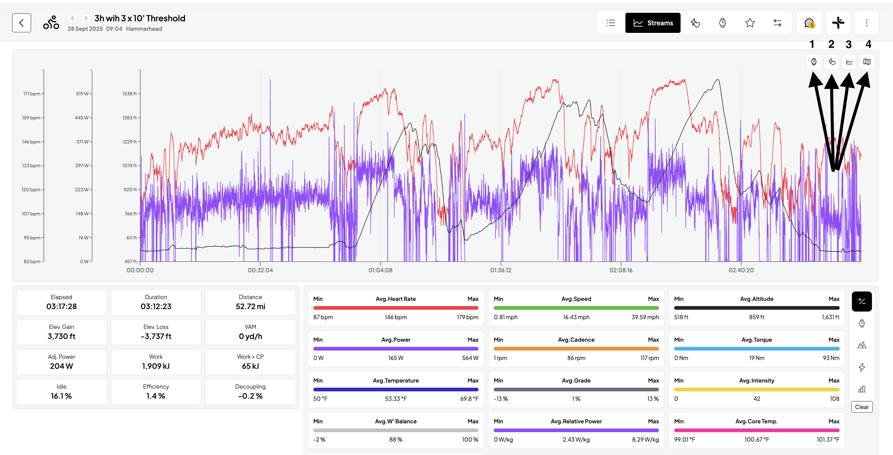
On the upper right-hand side, you will find four toggle icons. This is where you can customise your view:
Automatically detected Intervals: Vekta’s AI detects the start and end of each interval based on changes in power, cadence, and torque.
Power Zones: Toggle this overlay to visualise when an athlete is riding in specific zones during the workout.
Streams: Click the checkbox next to any metric (Power, Heart Rate, Elevation, etc.) to add or remove its "stream" from the chart.
Interactive Map: Open a draggable map that correlates performance data with the location.
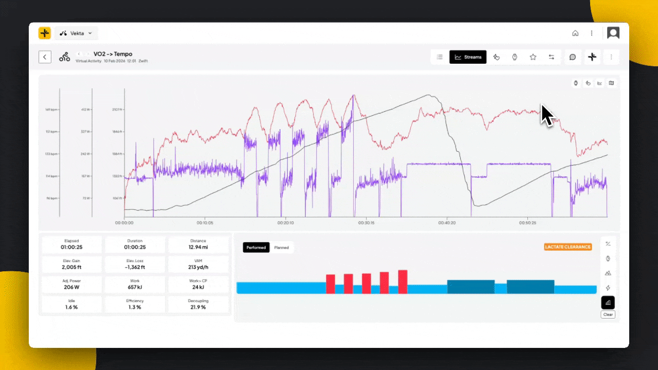
Analysis
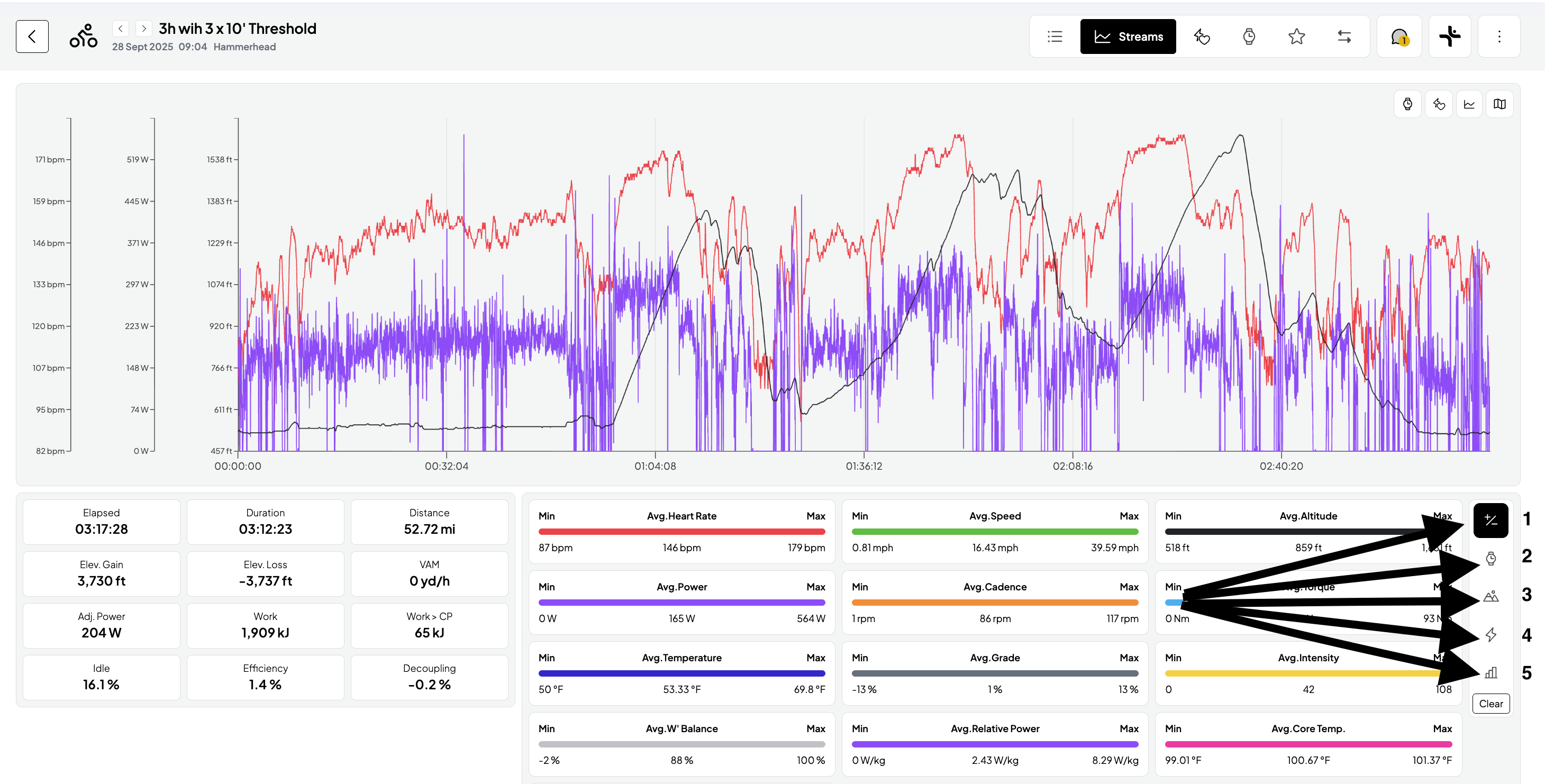
Beneath the main chart, you can toggle between five views to analyse the performance data in detail.
Statistics: View Min, Max, and Average values for every data stream. Note that any zoom selection made on the main graph will automatically auto-compute statistic and metrics to reflect only that specific range.
AI Detected Laps: Review intervals in a table format. Hovering over any lap in the table will highlight that section directly on the graph above.
Climbs: Focus specifically on climb intervals. Hovering over a climb interval highlights the interval on the main chart.
Peaks: View your peaks across durations (up to 2 hr). View these efforts as a percentage of your Critical Power (CP) and your all-time bests.
Performed vs. Planned: Provides a direct visual comparison of your actual power output against the prescribed workout.